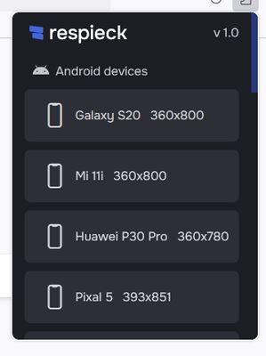
Respieck - Responsive Tester
Respicek: Your responsive design companion. Seamlessly preview and optimize your creations across devices. Intuitive interface, ensuring pixel-perfect adaptability from smartphones to desktops. The key to effortless responsiveness.
Manifest V2
Weekly download count: 10
Firefox on Android: No
Permissions:
- tabs
Size: 66.45K
Email: su*****@sammobadi.com
URLs: Website
Full description: See detailed description
Source: Firefox Browser Add-ons
Updated: 16 hours ago
User reviews
The Respieck responsive Tester is a tool that helps developers test their websites' responsiveness. It supports various devices and screen sizes and is essential for showcasing responsive design in today's digital landscape. The user experience is evaluated,
by Firefox user 18085253, 2023-10-06
Add-on safety
Risk impact
Respieck - Responsive Tester requires a few sensitive permissions. Exercise caution before installing.
Risk impact analysis details
- Critical Grants access to browser tabs, which can be used to track user browsing habits and history, presenting a privacy concern.
Risk likelihood
Respieck - Responsive Tester is probably trust-worthy. Prefer other publishers if available. Exercise caution when installing this add-on.
Risk likelihood analysis details
- High This extension support email may not be valid.
- High **** ********* *** *** **** ****** ********* ********** *** *** ** ****** ** *****
- Low **** ********* *** ******* **** **** * ****** **** ***** ******** *** **** ****** ** ** ****** *** *****
- Low **** ********* *** ***** **** **** * ****** **** ***** ********** *** **** ****** ** ** ****** *** *****
- Good **** ********* *** **** **** *******
Upgrade to see full risk analysis details
Similar add-ons
Here are some Firefox add-ons that are similar to Respieck - Responsive Tester: